
Product: iOS
Role: UX Writer, UX Design, Art by Vijay Verma!
Tools: Figma
Background
I have trouble learning new languages. Like many people, I go super hard for the first couple of months, and then life gets in the way, or I start playing video games. I knew I wanted to design an app for people who wanted to learn a new language but didn't know much more than that. Initially, I wanted to create a language learning app for college students, but DuoLingo and LingoDeer offer that option. I noticed an absence of langue learning apps for a younger audience. And thus, Language Buddy was born!
What is Language Buddy?
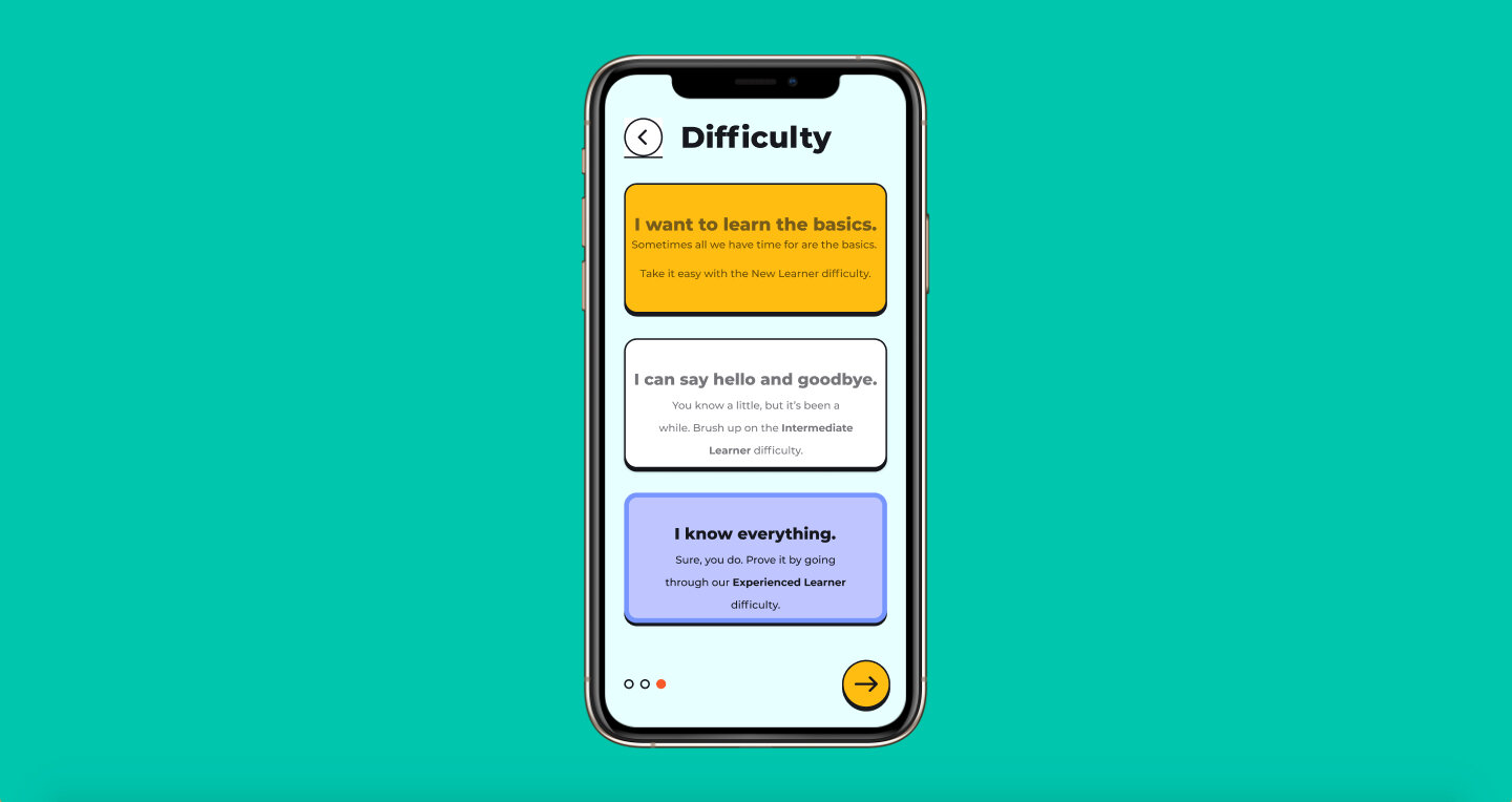
Language Buddy is a language learning app for younger users. My guiding philosophy was based on the ideas of interactivity and control of the pace. One of the things I struggled with while learning Spanish in high school and university was the pace. It was either too slow or too fast. I figure if I struggled with that, younger kids would as well. With that in mind, I wanted to give kids the feeling of being in control of what they learn, when they learn, and the difficulty of learning. They are in control of every step of learning.
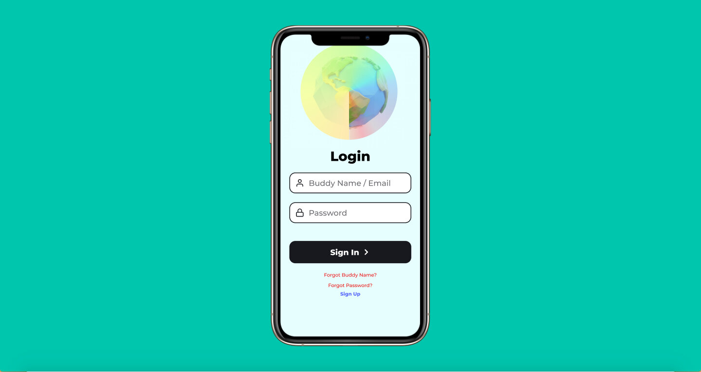
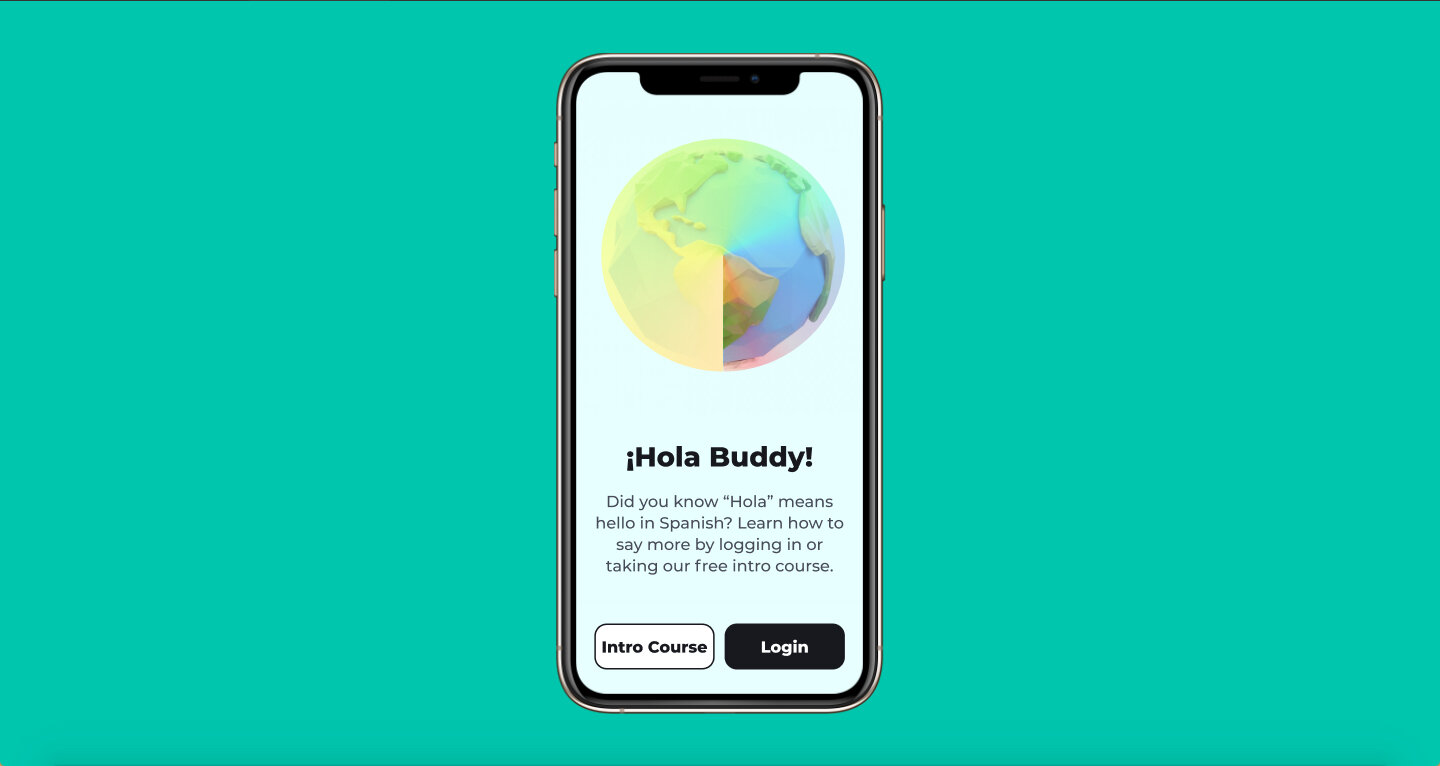
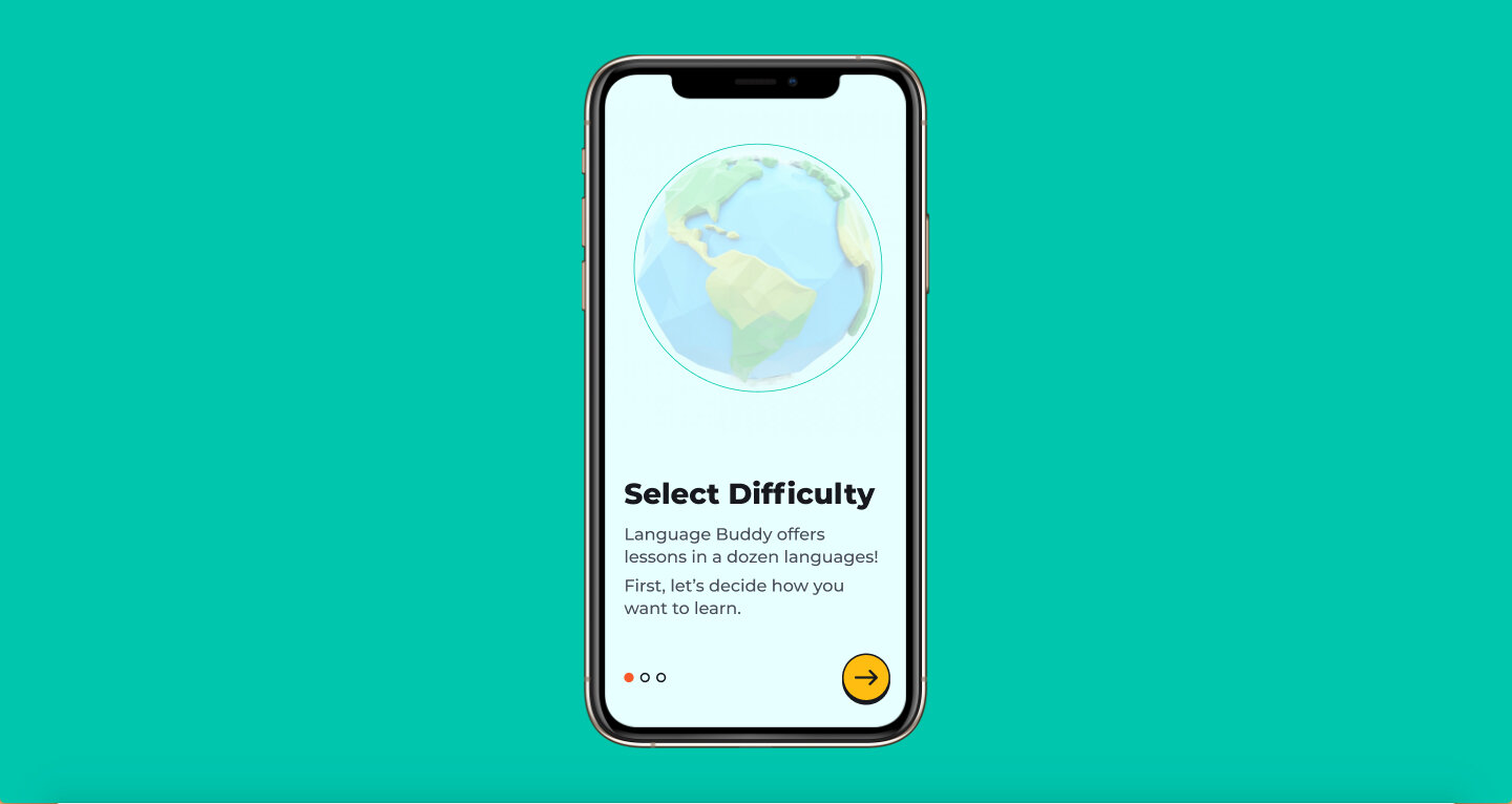
Onboarding Process
Email signup screen.
This is the email sign up screen that would appear after taking the intro course. I wanted the user to do a user course before signing up because I hate going through a tedious onboarding process for a product that I end up not using.
I thought it would be important to emphasize the point of creating a Language Buddy account, which would be to track progress and set reminders to study.
The whole point of the Buddy Name is to give younger kids a sense of attachment to learning. Learning a new language is supposed to be fun and challenging, however, a lot of language learning in schools can be detached and purely academic when it should actually be fun! Eventually, I would like to develop this into a full-on app and take customization a step further with a character/avatar creation element so that kids feel even more attached to learning.
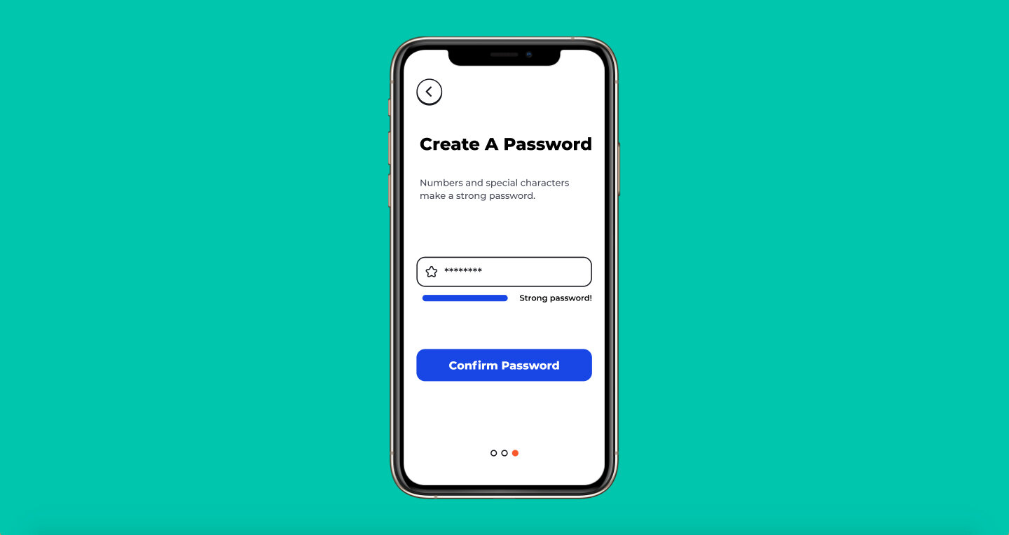
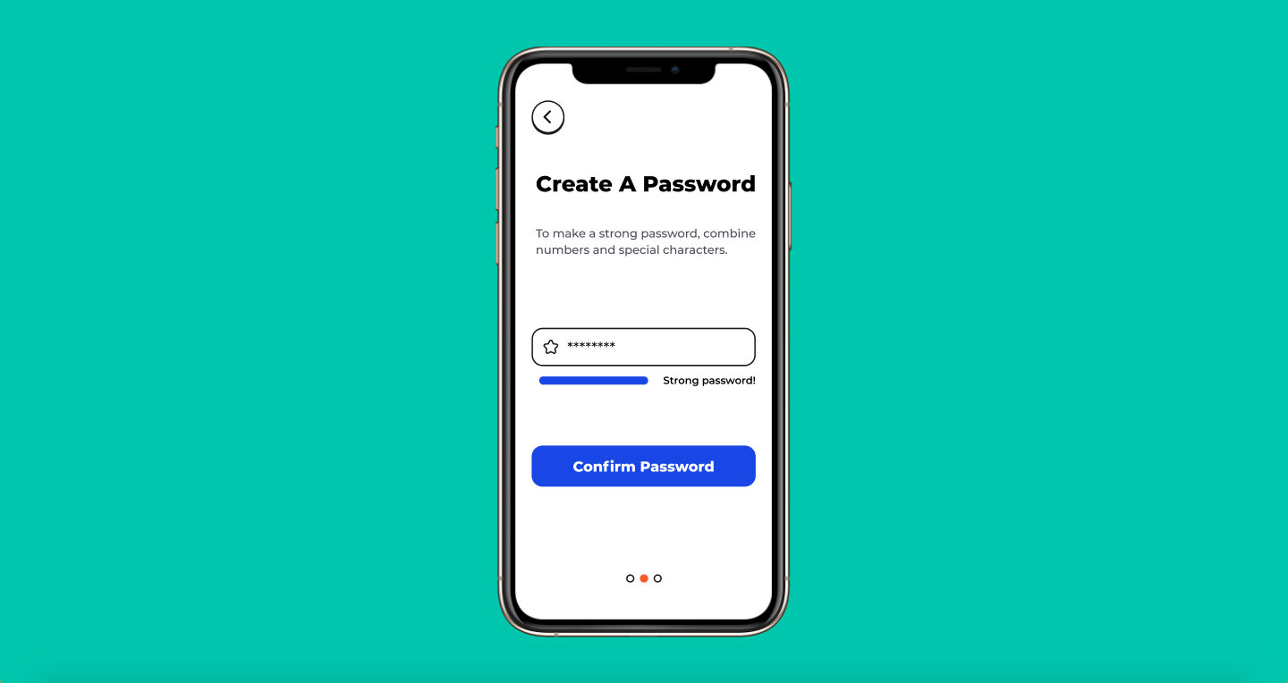
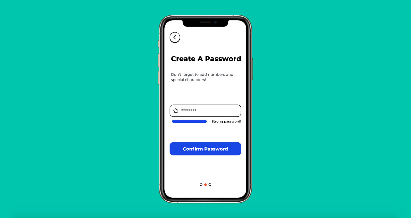
Above are the different iterations of the password creation screen I went through. I wanted to make sure the requirements of a strong password were clear. My first two attempts felt both clerical and wordy, so I wanted to try something that got right to the point. I landed on “Don’t forget to add numbers and special characters!” and utilized the strong password bar to let the user know if they fit the requirements.
Standard account creation confirmation screen. I wanted to keep the language to a minimum so that the user can get to their language as soon as possible.
Language Selection
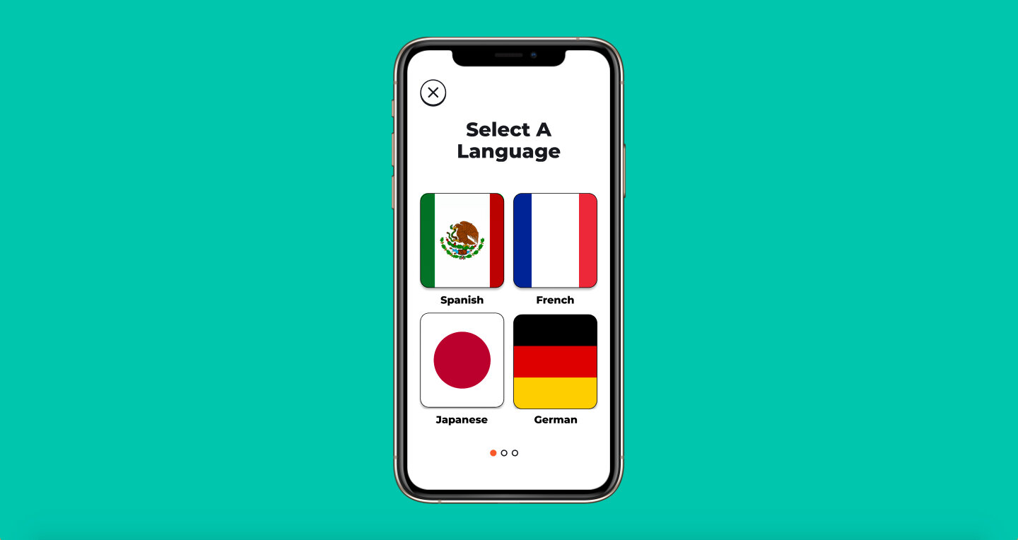
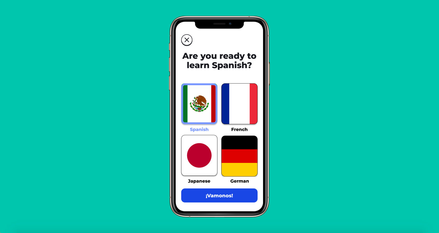
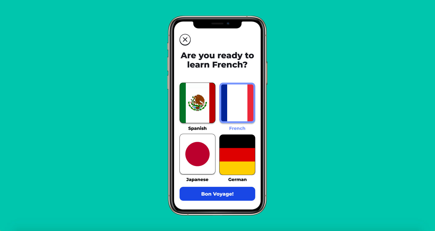
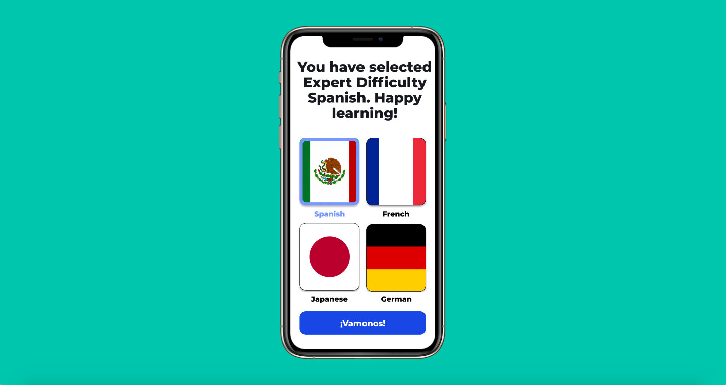
The language selection is more of a showcase for the UI, but I did add the fun confirm button! Depending on the language you select, the confirm button will be that language. In the above example, when you select Spanish, the confirm button becomes “Vamonos!” which translates to “Let’s go!” When you select French, the confirm button becomes “Bon Voyage!” which is used to wish someone good luck on their journey.
Target User
The target user for Language Buddy is a child under 15 who wants to learn a second language.
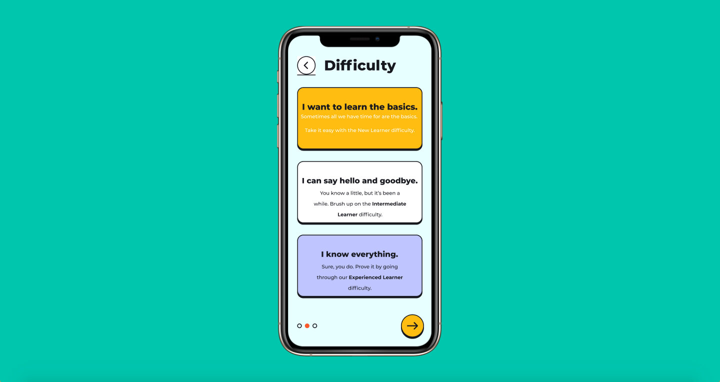
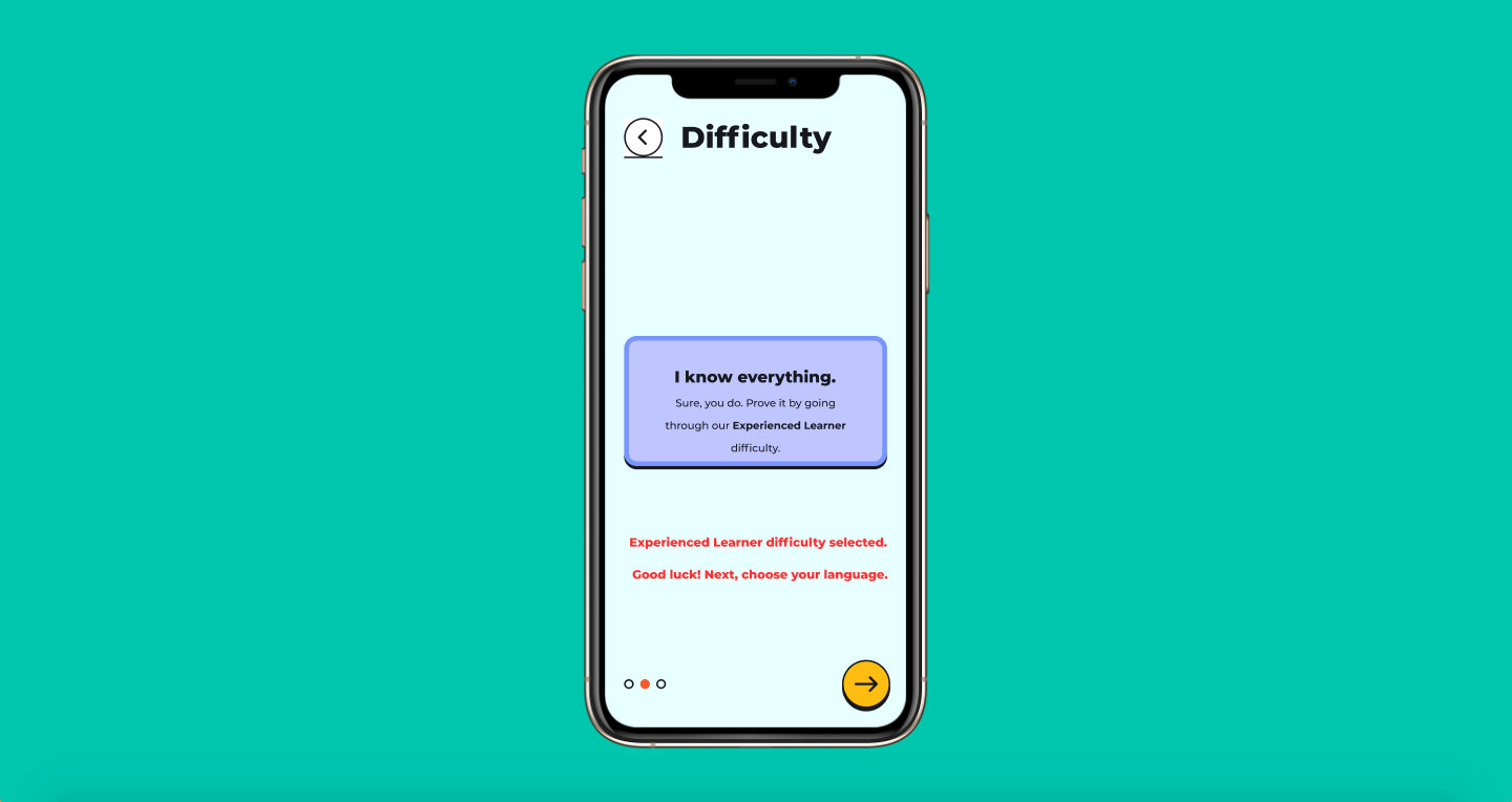
One element that didn't make the final design was the age-based difficulty selection process. I had initially had two difficulties: Under 10/ 10 - 14. I switched away from that for a more detailed/nuanced difficulty selection screen.
Notifications

I wanted to keep the number of notification settings to a minimum so that they weren’t too confusing. I hate receiving tons of notifications from language learning apps that aren’t really useful. Going back to the idea of controlling how you learn, I thought it would be good to give the user a chance to select what the app notifies them about. Word of the Day is something that I wish more language learning apps would utilize! I think it’s a fun idea and a way to ease larger/helpful vocabulary in.